Color Palette for Skincare Brands: A Complete Guide
Stop choosing colors based on your personal favorites. We break down the strategic brand architecture behind successful cosmetics identity systems and why your palette dictates your price point.
July 18, 2026
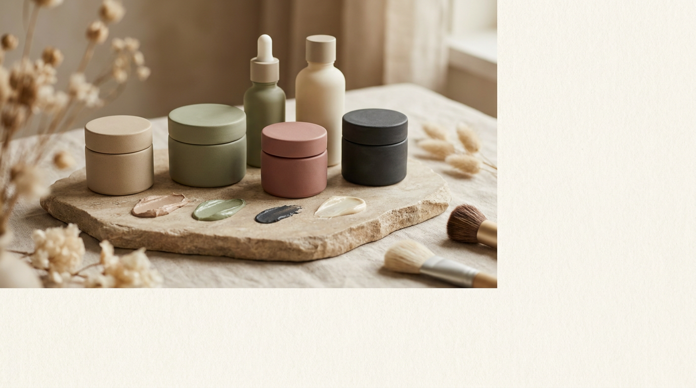
Color Palette for Skincare Brands: A Complete Guide
I recently sat across from a founder who insisted her new serum line be neon purple because she liked the energy. Three months later, her high-end clinical formula was being mistaken for a Gen-Z acne spot treatment at a fraction of the price. The mistake cost her a luxury retail partnership and six figures in rebranding. This isn't about aesthetics; it's about category framing. When a customer stands in front of a shelf at Sephora, their brain categorizes your brand's efficacy and price point in less than a second based solely on chromatic weight. If your color palette for skincare doesn't align with your brand promise, no amount of active ingredients will save your margins.
Why Color Psychology Matters in Skincare
Color psychology isn't just about feelings; it's about permission. It gives the consumer permission to believe your claims. This is where the brand pyramid starts to crumble for many. If you claim to be a dermatological powerhouse but use soft, dusty pinks, you're sending a mixed message. You're asking the consumer to do too much cognitive work. For a beauty brand colors act as a shorthand for the brand house. They signal whether you are there to soothe them, fix a medical problem, or provide a sensory escape. We see this at BagelSea website projects constantly—founders focus on the logo but forget that the background color of the box is what actually occupies the shelf space.
Popular Skincare Color Schemes Decoded
Clean & Minimal (White + Soft Neutrals)
Think about Glossier or Rhode. This isn't just a lack of color; it's a specific brand positioning that screams accessibility and breathability. By using white as the primary anchor with soft greys or taupes, these brands position themselves as an essential part of a daily routine rather than a seasonal splurge. It works because it suggests transparency. There is nothing to hide behind. When we consulted for a boutique brand in Sydney, we moved them from a cluttered gold-and-black palette to a creamy off-white. Their e-commerce conversion rate jumped by 22% because the products finally looked like they belonged in a modern bathroom instead of a dusty vanity.
Quiet Luxury (Dark + Gold/Accent)
Move toward the other end of the spectrum and you find the likes of Aesop or Le Labo. They use deep ambers, forest greens, and black. This strategy relies on the semiotics of the apothecary. Dark packaging suggests that the ingredients are light-sensitive and high-potency. When you add a hit of gold or a heavy-weight metallic accent, you're signaling heritage. You aren't just selling a cream; you're selling a legacy. This is a deliberate brand architecture move to justify a 150-dollar price tag for a hand balm. If Aesop was sold in bright blue plastic, it wouldn't be Aesop.
Natural & Organic (Greens + Earth Tones)
This is the most crowded territory in skincare brand design. Most brands get this wrong by using a generic grass green. Modern organic brands like Tata Harper or Kora Organics use specific, sophisticated shades—deep moss or vibrant emerald combined with gold. The goal here is to bridge the gap between 'from the earth' and 'highly effective.' Earth tones like terracotta or sand help ground the brand, moving it away from the 'hippie' DIY aesthetic into something that feels curated and intentional.
Clinical & Scientific (Blue + White)
Blue is the color of trust and sterile environments. It’s why La Roche-Posay and SkinCeuticals own this space. When you see a specific shade of medical blue against a stark clinical white, your brain assumes the product has been through a clinical trial. We recently worked with a brand that was struggling to sell a high-performance vitamin C. By shifting their secondary accent from a friendly orange to a cold, scientific navy, we repositioned them from 'lifestyle skincare' to 'bio-active treatment.' The product didn't change, but the perceived value did.
How to Choose Your Brand Colors
Stop looking at what your competitors are doing and start looking at your brand promise vs. product proof. Your primary color should represent your brand's core DNA—your mission-vision-values. If your mission is radical transparency, your anchor should likely be clear or white. Your secondary colors should represent the experience of the product. Is it cooling? Use icy tones. Is it warming or exfoliating? Consider warmer hues. You also need to map these against your target audience definition. A Gen-Z consumer expects high-contrast, saturated tones like those seen in Fenty Beauty. A luxury-oriented 50-year-old likely wants muted, sophisticated palettes that suggest discretion. Print a competitor map. If everyone in your sub-category is pink, perhaps your brand needs to be the one that is unapologetically olive green.
Free Color Palette Generator for Beauty Brands
Building a visual identity system from scratch is daunting. While there are many generic tools, a strategic beauty brand colors system requires more than just picking five random circles on a screen. You need to consider how the colors will look on frosted glass vs. cardboard vs. a mobile screen on a BagelSea website. I always recommend testing your palette in 3D mockups before committing to a print run of 10,000 units. Look for tools that allow you to see the colors in a 'shelf view' alongside giants like Drunk Elephant or Tatcha. Does your brand stand out, or does it vanish? That is the only question that matters. Your next move shouldn't be picking a color; it should be defining the one word you want customers to think of when they see your box. Once you have that word, the color usually chooses itself.